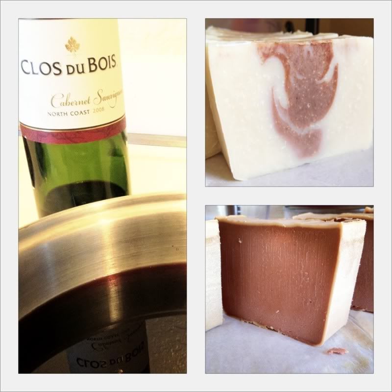
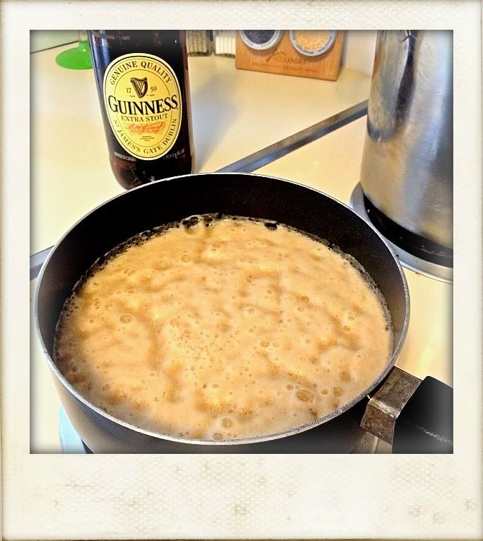
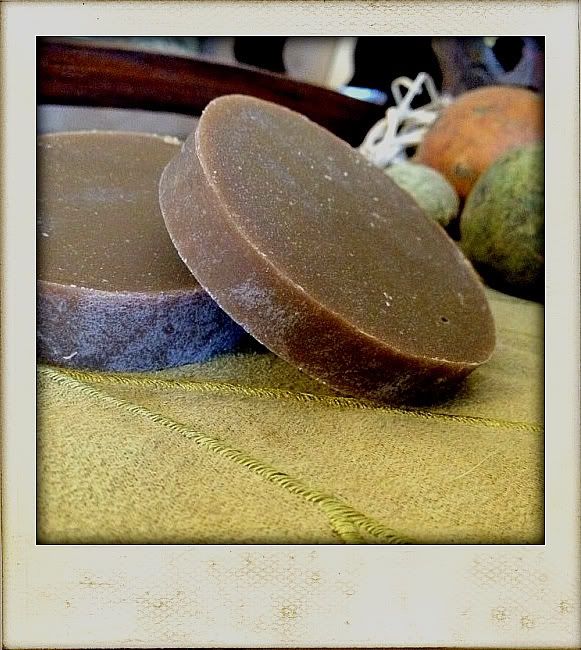
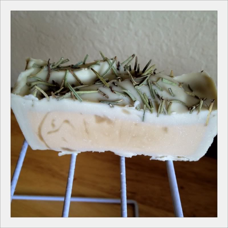
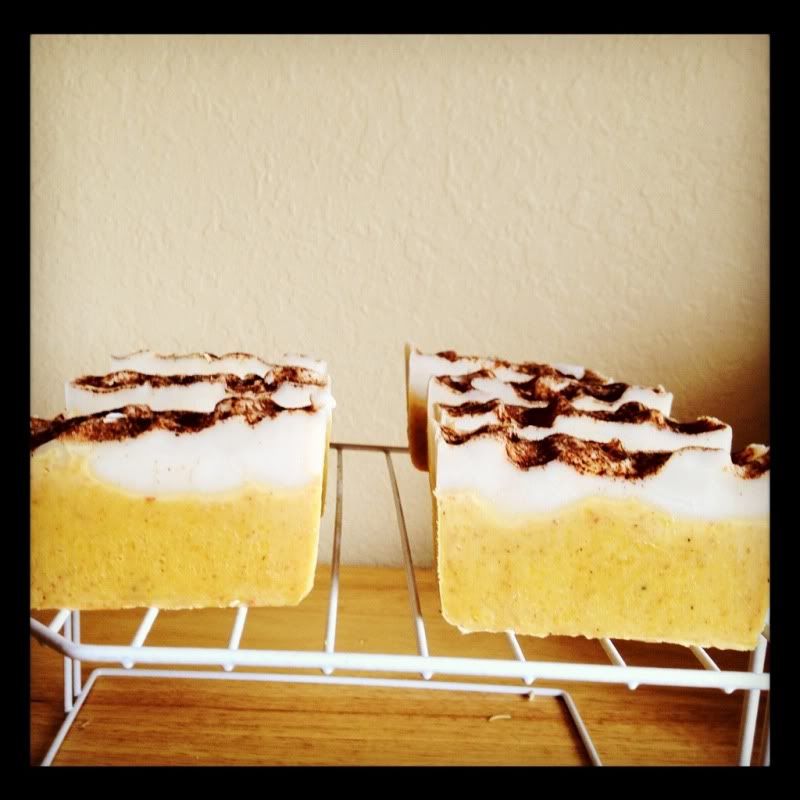
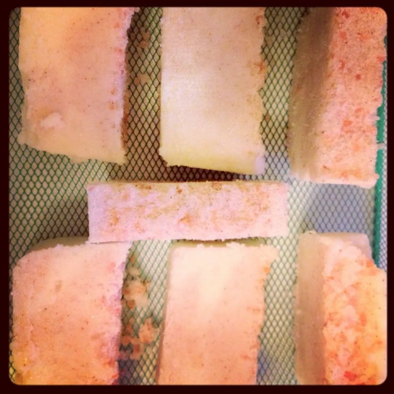
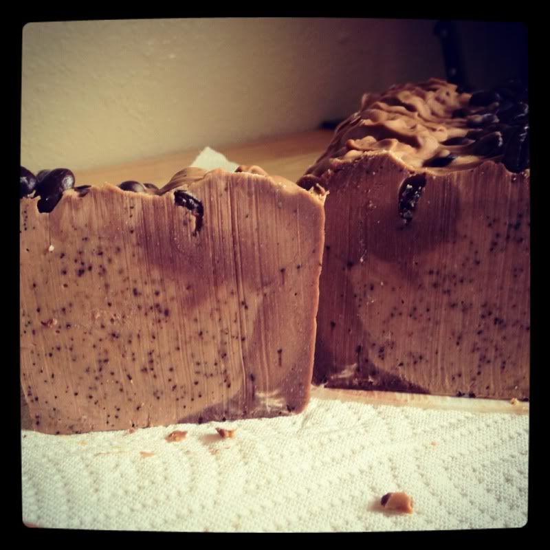
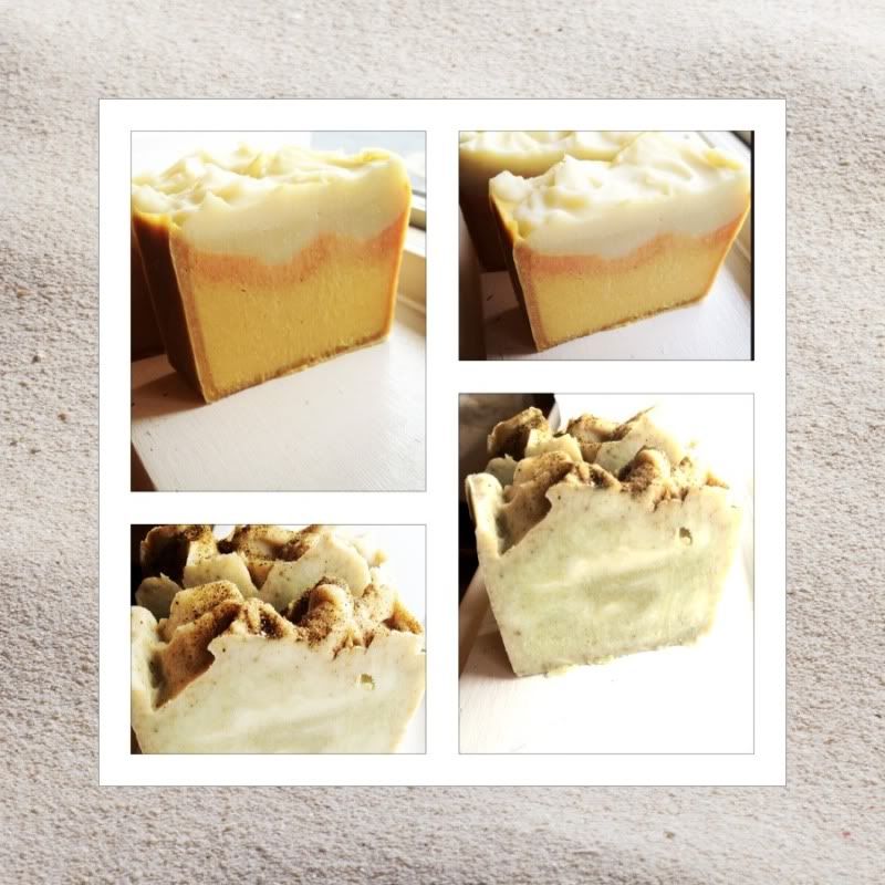
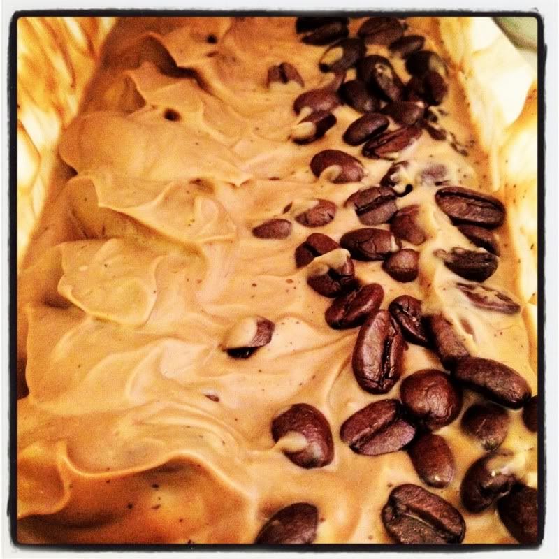
I have to be honest, not much soaping has been going on in my house as of late, and I find it pretty frustrating! The reason is that I am going to be moving in 2 months and 1) I can't afford things like yummy scents and pretty colors, so any soap I make is going to be pretty boring, especially since I'm running out of oils! 2) I don't want to have to move a bunch of soap!
But I haven't forgotten about soap complete, instead I've been doing things like research - lots and lots of research. Researching lotion making, shampoo making, shampoo vs. bar soap and their effect on hair, packaging, how to make the packaging I want to work, coming up with different packaging ideas, working of labels - so I have been pretty busy over here! It's just very frustrating because I haven't been able to put any of my ideas into action... But I thought I could at least do a little show and tell.
For those who don't know, I'd like my brand to be "modern day apothecary" - but first I had to figure out what that meant to me! Basically, I took old-school apothecary and tried to add a little sophistication to it. It means sticking to natural colors. It means simple.
So here is the soap label I came up with!


 I am still having a terrible time coming up with a font! I don't really like the first one, I decided to include it simply for comparison. I'd like the scent to look handwritten, and I've chosen an old fashioned typewrite font for the general information, which I love! I am going to assign each scent of each product a "number" which I think adds to the "apothecary" feel. I chose a kraft paper background because I plan to use kraft boxes and don't want too much going on - but once I am able to get custom boxes printed I think I am going to go with a light natural linen look, like this:
 But for now I think it may clash with the kraft boxes.
So, what says "modern day apothecary" to you? Which font most accurately portrays that description? I'd love any opinions!
Until next time...
Peace · Love · Soap
But I haven't forgotten about soap complete, instead I've been doing things like research - lots and lots of research. Researching lotion making, shampoo making, shampoo vs. bar soap and their effect on hair, packaging, how to make the packaging I want to work, coming up with different packaging ideas, working of labels - so I have been pretty busy over here! It's just very frustrating because I haven't been able to put any of my ideas into action... But I thought I could at least do a little show and tell.
For those who don't know, I'd like my brand to be "modern day apothecary" - but first I had to figure out what that meant to me! Basically, I took old-school apothecary and tried to add a little sophistication to it. It means sticking to natural colors. It means simple.
So here is the soap label I came up with!


So, what says "modern day apothecary" to you? Which font most accurately portrays that description? I'd love any opinions!
Until next time...
Peace · Love · Soap